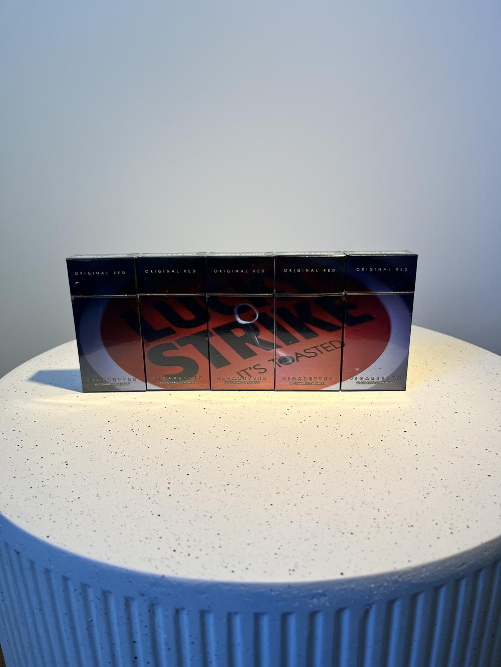
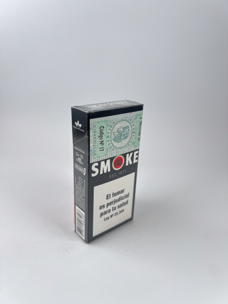
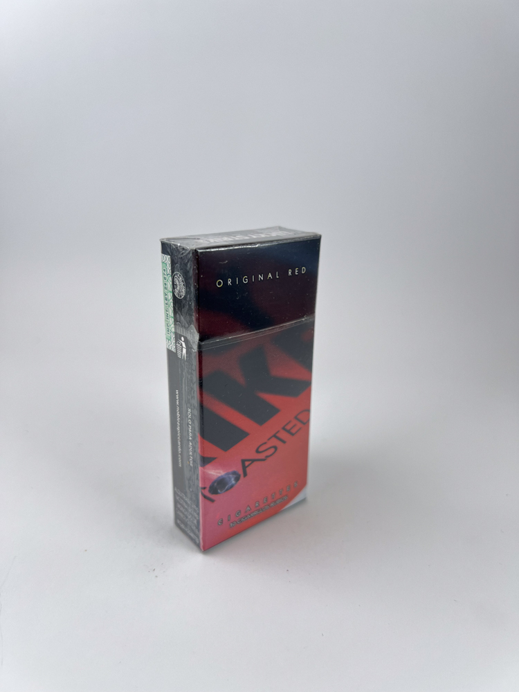
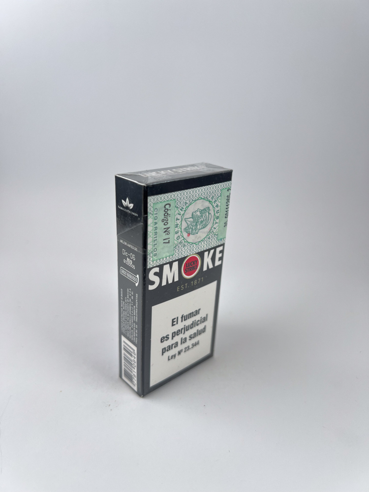
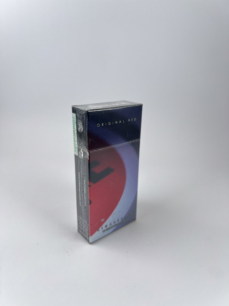
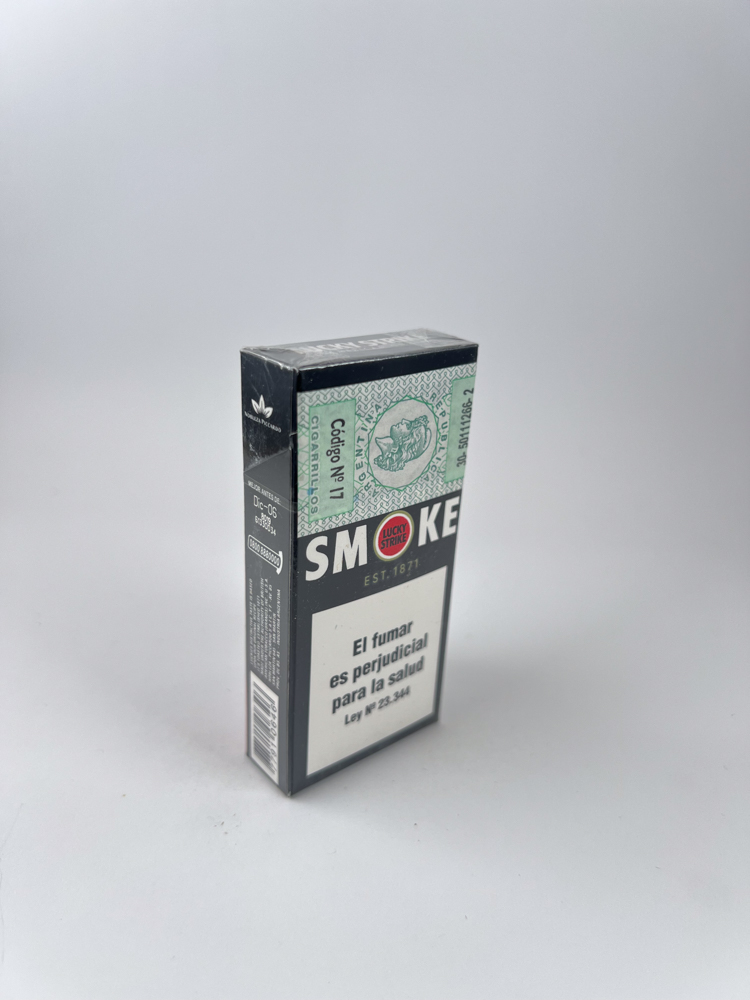
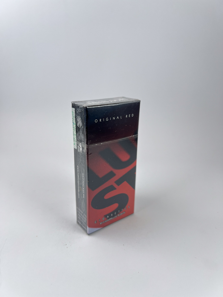
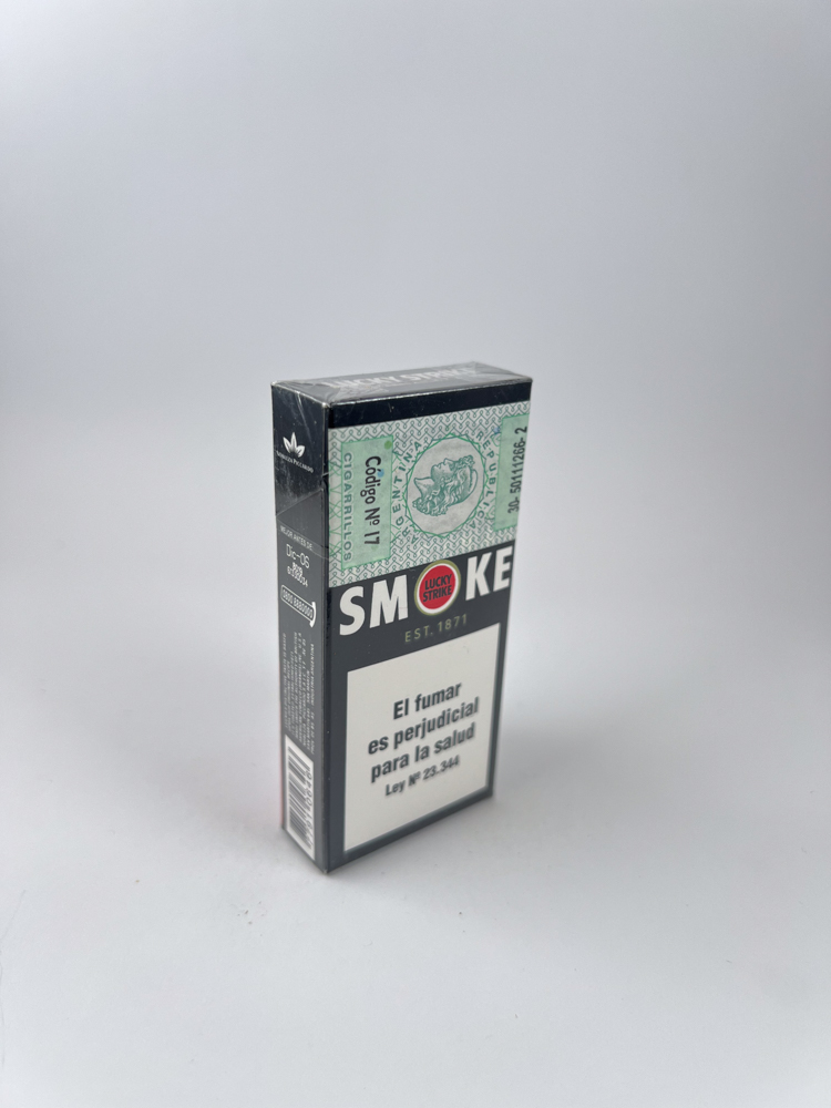
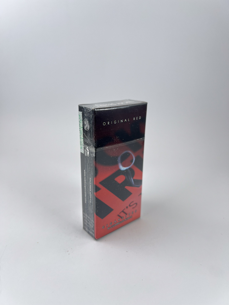
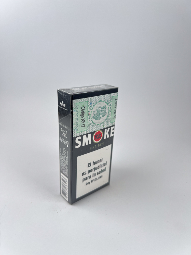
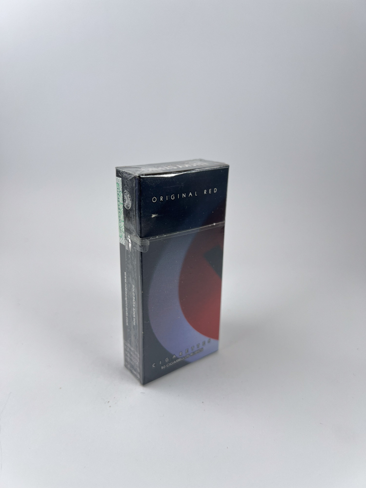
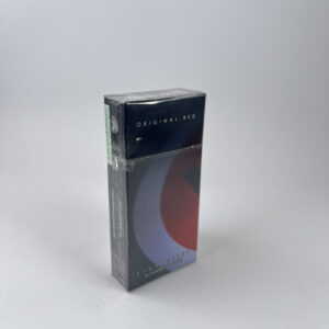
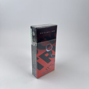
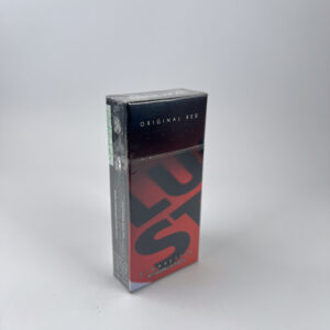
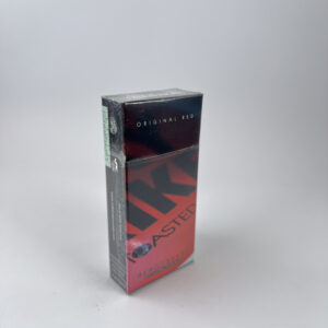
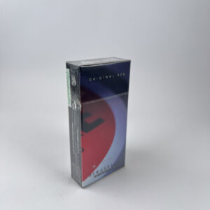
Description: This series features a modernized Lucky Strike design - a large red circle (logo) across the entire pack with the words "It's Toasted". Unlike the classic versions, this one uses a minimalist, almost "flat" design style with gradients and higher contrast.
The 5 packs in the set form a continuous visual line – when placed side by side, a continuous design effect is visible (the logo „expands“ across all packs). This is no longer a random set, but a deliberately collectable composition.
These types of "panoramic" or continuous designs are valued more than single uniform packages because they represent the complete idea of the series.
Historical data: This design came about as Lucky Strike attempted to modernize its image for a younger market while maintaining the iconic "It's Toasted" identity. In Latin America, such experimental designs appeared more frequently than in Europe, making them more interesting to collectors.
This was before the introduction of "plain packaging" in many countries, so these are some of the last fully mature modern Lucky Strike designs.